The LynxKite design evolution
I love reading about how software designs evolve. Finding the best way to represent and communicate things is challenging both in the code and on the user-interface. This article is my recollection of the journey that took us to LynxKite’s current design.
LynxKite’s development started in 2014. We wanted to build a scalable analytics engine. We looked at the technologies available for distributed computing and experimented with different options. By April we had arrived at using Apache Spark. Spark was only at version 0.9.0 at the time, but our bet paid off. Code in functional languages translates very easily to distributed computing and running on a JVM made it straightforward to integrate with Hadoop systems.
![]()
(Logo concept from 2015.)
LynxKite quickly converged to an architecture where the backend represents vertex sets, edges sets, and attributes as immutable entities. These entities are connected to each other through operations that use some entities as inputs and produce some entities as outputs. We’ve been calling this graph of entities connected by operations the LynxKite metagraph.
The earliest versions of our UI directly exposed this metagraph with lots of colorful bubbles and
merry animations. But the metagraph operations are quite low level, which made this painful to use.
For example, the VertexAttributeFilter operation outputs a new, filtered vertex set and a mapping
(an edge set) from the new vertices to the originals. Then you can use the
PulledOverVertexAttribute and PulledOverEdges operations to create updated versions of any
attributes or edges that the original vertex set had.
By the end of the year we fixed it by collecting a vertex set and its attributes and edges into a
package which we now simply call a “graph”. Instead of executing metagraph operations directly,
you execute frontend operations which make sure that the graph is always a consistent and relevant
collection of metagraph entities. A frontend operation automatically applies the PulledOver
operations as part of filtering, for example.
At the start of 2015 we were ready with LynxKite 1.0. I remember the scramble to add backward compatibility starting from this release. That had never been a concern before, but now data scientists were waiting to start using our application.
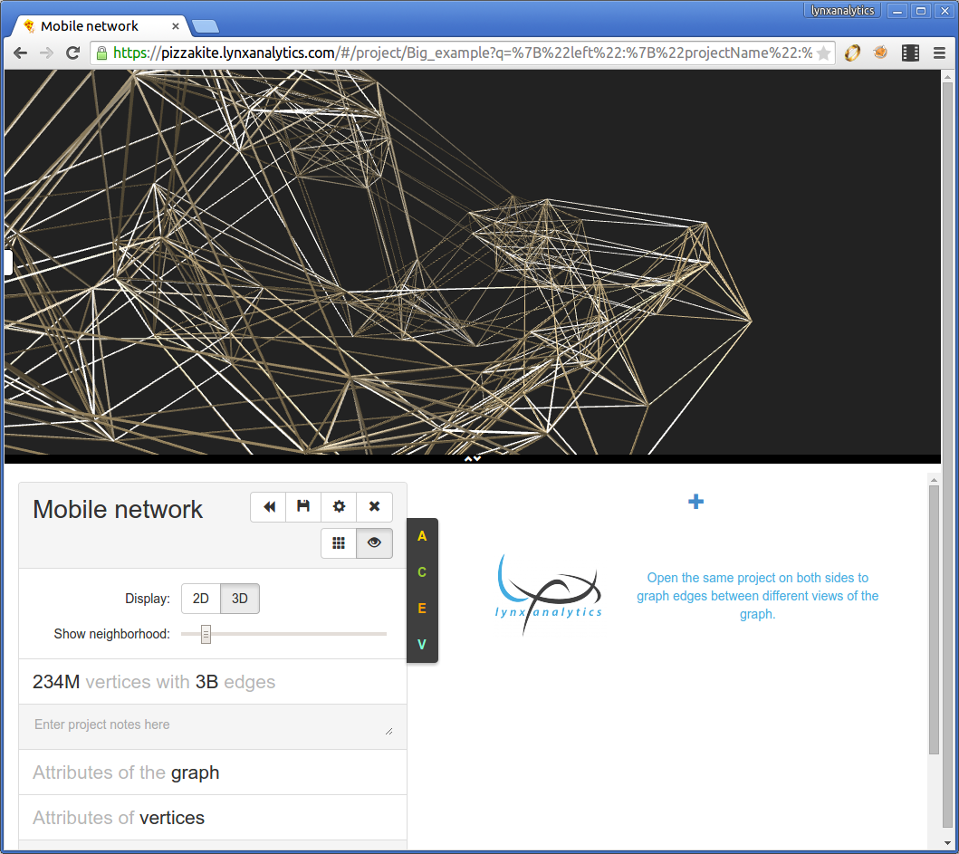
As this LynxKite 1.x screenshot shows we had two columns for editing two graphs, and a visualization above them. Clicking the A/C/E/V buttons you could find and apply operations to the graph.
This was widely used in a lot of data science projects and we introduced many new features over 2015 and 2016. One feature stands out that led us to eventually completely rethink the interface of LynxKite. This feature was the history view.
In LynxKite 1.0 if you applied a filter or other operation, it modified your graph in place.
You could undo and redo operations. But this was not enough for explorative data science work.
You filter to vertices with degree > 5, compute some graph metrics, train a machine learning model,
get some results, etc. And then you wonder, what if I had filtered to degree > 6?
The history view showed your whole history of operations and allowed you to edit it. We thought it would come in handy on occasion if you want to change something in the history. But users took this feature way further. Data scientists basically spent all their time on the history page.
By the end of 2016 we started thinking about changing LynxKite to put this history front and center. As the ultimate data science productivity feature we wanted to allow non-linear histories too.
By the first half of 2017 our team had grown to about a dozen engineers. We split off the
boxes-and-arrows Git branch and worked together to implement this much more ambitious UI.
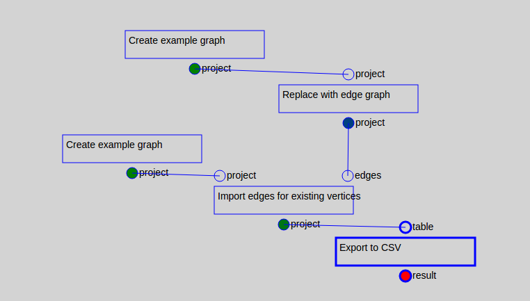
It was a time of intense design discussions. But for a long time we focused on the functionality
and ignored visuals. The new UI looked like this:
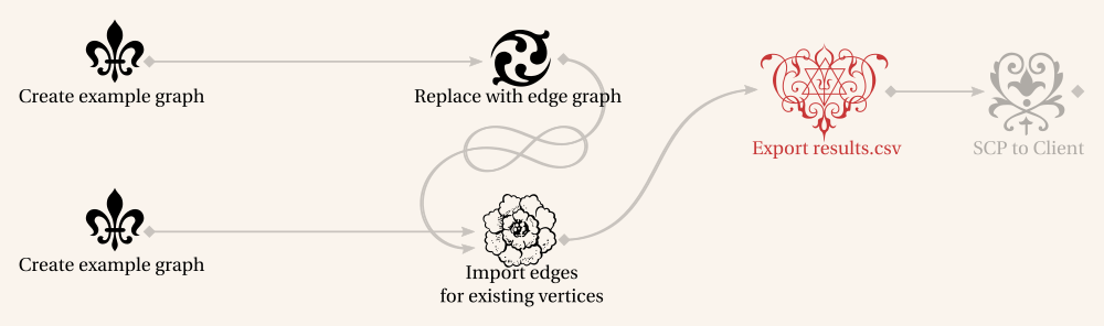
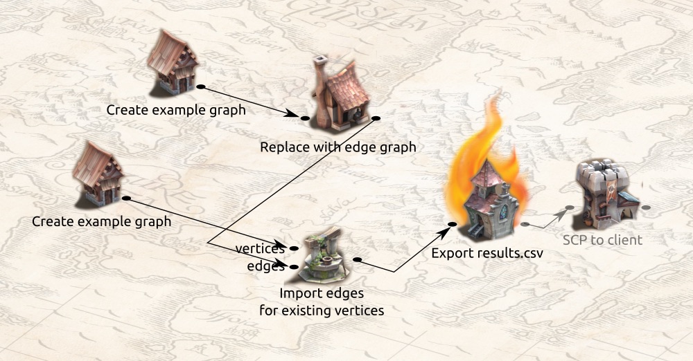
When we were getting close to finalizing the interface, we had some fantastic design ideas:
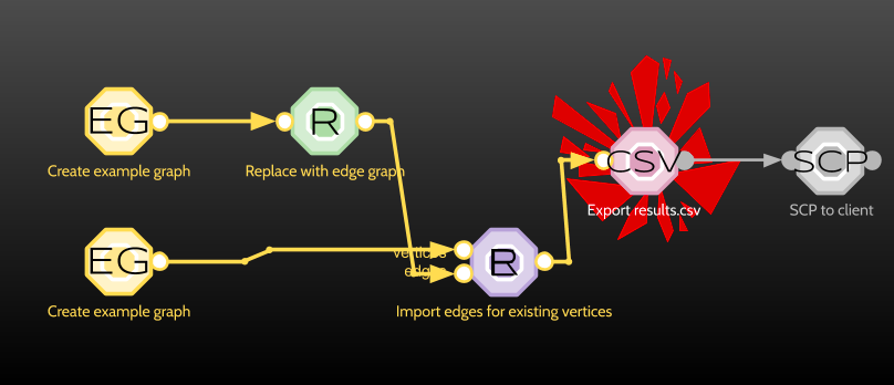
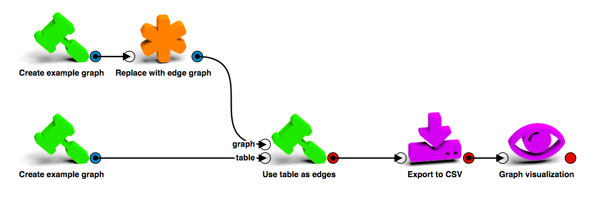
After discovering how cool it is to render icons with POV-Ray we settled on the design you see today:
LynxKite 2.0 was released in September 2017.
We have made many improvements since then. LynxKite 3.0 in 2019 has introduced Sphynx, our fast
single-node backend. LynxKite 4.0 in 2020 fixed a lot of issues that we could not have done
while preserving direct compatibility and marks the open-sourcing of LynxKite.
(See CHANGELOG.md for the
detailed history.)
We expect the LynxKite 4.x line to have a very long life with no compatibility-breaking changes from now on. But that does not mean you can’t be part of a future with huge new ideas! We are in the process of completely redesigning visualization controls right now. Check out the project on GitHub if you want to join us!