Graph-metric-based intervention strategies in an epidemic
In this post we demonstrate - using a model of a hypothetical infectious disease - how a graph-metric-based targeted intervention can have a huge impact on the course of an epidemic.
The spread of a contagious pathogen is naturally modeled using a graph: the graph of connections between people. What a “connection” means depends a lot on the concrete disease, but it’s basically just an event that allows the pathogen to jump from one host to the next with certain probability.
If we knew this graph and had good estimates for contraction probability then we can easily compute probabilistic estimates or run simulations to predict how the number of infection changes over time.
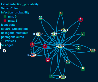
For example, consider the above part of a connection graph. We are looking at the neighbors of the light green square in the middle. He has four currently infected neighbors - see the red hexagons. So assuming a 10% chance of getting infected by an infectious connection we estimate his chances of getting infected as \(1 - (1 - 0.1)^4 = 0.3439\). We see over time this will change. His infected neighbors will be cured eventually - he already has one cured neighbor, the dark green pentagon. On the other hand, many of his connections are still susceptible (all the squares), so as they get infected they might pass over the disease to him later.
When trying to control an epidemic what authorities try to do is basically altering this connection graph in various ways. For example, vaccinating a selected set of people or providing extra protection to them some other way means removing critical vertices from the graph. Banning certain kinds of events/activities, closing down certain locations mean removing certain edges.
So it is critically important to understand what nodes and edges we should remove! We argue that using well established graph metrics can be very efficient in the selection.
Using LynxKite, we created a simulation exactly as explained above. It is of course an over-simplified model, the 10% contraction rate is out of thin air, we do not consider incubation times and, probably most importantly, the graph we use is just a friendship graph from an old Slovakian social network, Pokec, clearly very different from a real connection network for a real disease. But it will still work to demonstrate the points above.
Once we had the simulation workspace ready, we ran it in different scenarios and observed how the course of the epidemic changed. A scenario consist of removing certain vertices and edges from the graph, using some graph metric. E.g. removing 2000 vertices that have the highest pagerank.
You can play around with our simulation yourself! Just head over to our wizard. If you are interested in the technical details also check out the workspace behind the wizard which shows how one can implement such an analysis in LynxKite.
So let’s check out a few interesting scenarios!
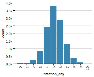
First of all, this is what happens without any intervention:
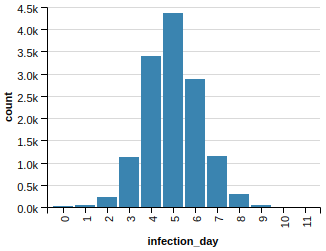
In our graph with 28k vertices we have a sizable epidemic! (In fact, 13k gets infected eventually.)
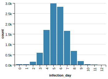
Let’s try the above mentioned scenario, let’s remove vertices with top pagerank!
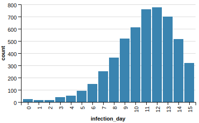
This is clearly much-much better, we managed to tame our epidemic by a large margin: the peak of daily new infections went from around 4,500 to 800.
Actually, we get similar results by using a much simpler graph metric, degree, instead of pagerank:
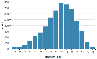
In fact it’s a bit better. It goes up and down faster without peaking higher.
At this point one might suspect that just removing any vertices helps. Well, it does, but not even close to what the selected removal achieves. This happens if we remove 2000 vertices randomly:
Better, but only slightly.
Or maybe the effect is related to the sheer number of edges removed? Of course, if we remove the top degree vertices we will get rid of much-much more edges than dropping random vertices. Indeed, random vertex removal resulted in 78,078 dropped edges while removing the top degree ones dropped 284,596! So let’s test this hypothesis and drop the exact same number of edges randomly (without touching the vertices)! Here is what we get:
Better than the random 2000 vertex drop but still very far from the effect of dropping vertices selectively.
But what if we removed edges selectively? We could build a slightly more complex model to identify the connections that contribute the most to the course of the epidemic, and then target these connections. A heuristic idea could be that isolating high-degree nodes from each other is key.
This idea is easy to tested in LynxKite, for example by filtering based on the product of the endpoint degrees.
Let’s do that, removing again the exact same number of edges:
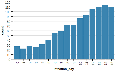
As you can see, this is the best scenario so far! We managed to tame our epidemic from a peak of 4,500 down to just 115.
As noted above, all this is just on a toy epidemic model. Our conclusion - best to remove edges based on degree product - absolutely does not translate directly to the current COVID situation. But the same analysis could be done for real, given a good approximation of the connection graph and a more serious infection model specific to COVID.
A good, real connection graph is the more challenging of the two. Telcos do have smartphone movement data which can be transformed into a connection graph using colocation techniques (two people are connected if they happen to be at the same place at the same time). This is very sensitive data and privacy considerations have to be taken seriously. Still, this analysis can be done on anonymized data, and it’s also possible to work in a super protected environment. So it’s hard, but not impossible.
So if you are an epidemiologist in the front line trying to fight COVID and you think you might be able to access the necessary data, do consider this type of analysis! LynxKite is a free tool that can help a lot with such a project and we are also happy to help!