Explaining GNN predictions with Gemma 4
LynxKite has a flexible graph neural network designer where you can choose from a variety of GNN layers. Graph attention networks (GATs, Veličković et al., 2017) are a great choice in many applications. In addition to providing good predictions, GATs are unique in that the attention mechanism gives us insights into what the prediction is based on. This post will explore how we can interrogate the inner workings of a graph neural network and generate a human-readable explanation for its predictions.
Graph attention networks
In a message-passing GNN, the state of a node is updated based on the states of its neighbors. To turn the states of the neighbors into a single vector, we need to aggregate them. We need to define an aggregation function that takes the states of the neighbors and produces a single vector. We want to make the aggregation function permutation invariant, that is, we do not want the order of the neighbors to matter. There are not a lot of permutation invariant functions. The simplest options are sum, mean, and max. The problem with all three is that irrelevant neighbors can drown out the signal from relevant neighbors.
With a GAT a node considers each neighbor on its own first and decides how much attention to pay to it. Then it takes a weighted average of the neighbors. The weights are the attention scores.
Attribution
In the attribution task our goal is to explain a prediction of the model by pinpointing the parts of the input that had the largest impact on the prediction. The attention scores are perfect for this. We can save them during inference and use them to explain the predictions of the model.
Let’s look at a concrete example. Our graph is constructed from the following data sources:
- A tissue-specific protein-protein interaction (PPI) network from TissueNexus.
- A drug-gene interaction (DGI) graph from DGIdb 3.0.
- A disease-gene association graph from DisGeNET.
Following in the footsteps of Bazgir et al., 2024 I use this graph to predict drug responses. I trained a small 2-layer GAT model on the PDX dataset from Gao et al., 2015. I let it train overnight and it achieved an accuracy of 77%. I would not let it choose my cancer treatment, but it works for this demo.
We can select a drug and disease pairing and get a prediction for the drug response. We also get the attribution scores for each node, calculated from the attention scores.
As an example, let’s look at the prediction for the drug combination BYL719 + LEE011 for breast cancer. The model outputs a prediction of 0.99, which means that the drug combination is predicted to be effective against breast cancer.
The next step is visualizing the attribution scores.
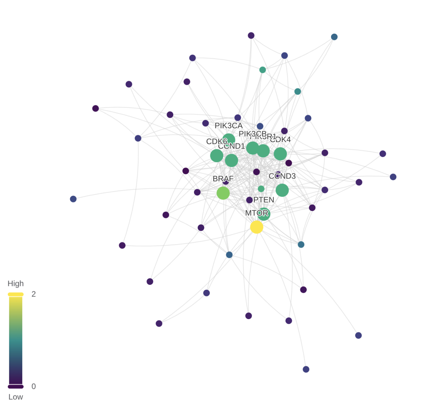
The protein-protein interaction network is a large graph with millions of edges. I’ve created a LynxKite box to see the top 10 nodes by attribution score, and the top 20 neighbors of those nodes. We see that MTOR, BRAF, and some other nodes are the most influential.
There we have it. The inner workings of the graph neural network have been revealed. And yet, this attribution graph is even harder to interpret than the original prediction. Why does the neural network pay extra attention to these genes? What do they have to do with the drug combination and the disease?
Looking at the graph doesn’t help much. Even with less than 30 nodes, it’s still too much to take in, and yet not enough to answer our questions.
Explanation
To make sense of the attribution graph, a human expert would need to put the highlighted parts of the graph into the context of known biology. I don’t have an oncologist on hand, but let’s try and see what Gemma 4 can do.
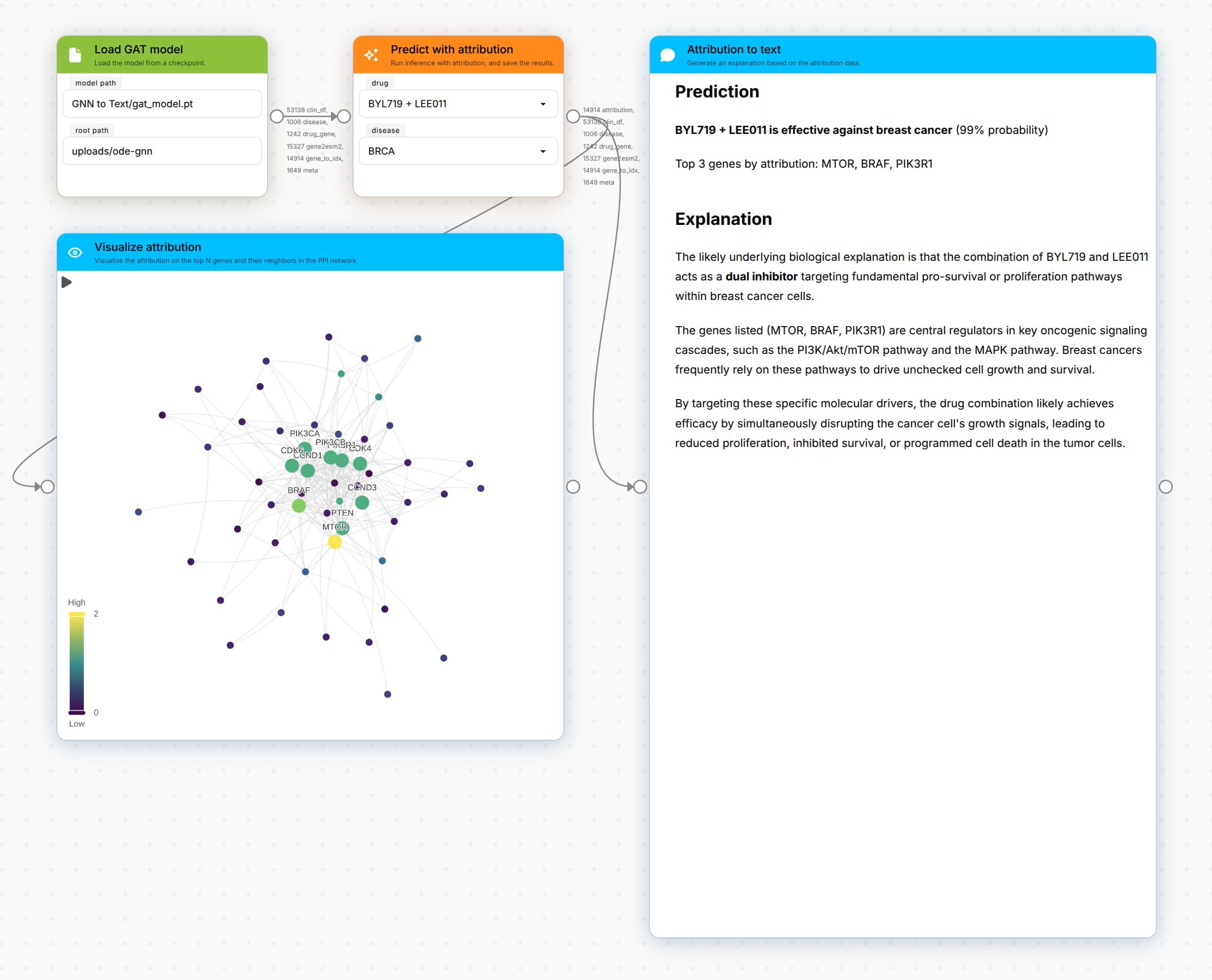
The prompt passed to Gemma 4 is the following:
A neural network predicts that BYL719 + LEE011 is effective against breast cancer, after considering the role of genes MTOR, BRAF, PIK3R1. What is the likely underlying biological explanation?
It takes unsloth/gemma-4-E4B-it-GGUF:Q3_K_S
(temp 1.0, top-p 0.95, top-k 64) only a few seconds
to generate this plausible sounding explanation. It’s amazing how much world knowledge is present in
such a small model. It was able to tie the listed genes to the PI3K/Akt/mTOR and the MAPK pathways.
As impressive as this is, we don’t want to rely on the world knowledge of any model. We want to ground the explanation in reliable sources. For this demo I adjusted the box to download the Wikipedia articles for the listed genes, for the targeted disease, and for the drugs. When we dump these Wikipedia pages into the prompt, we see a marked improvement:
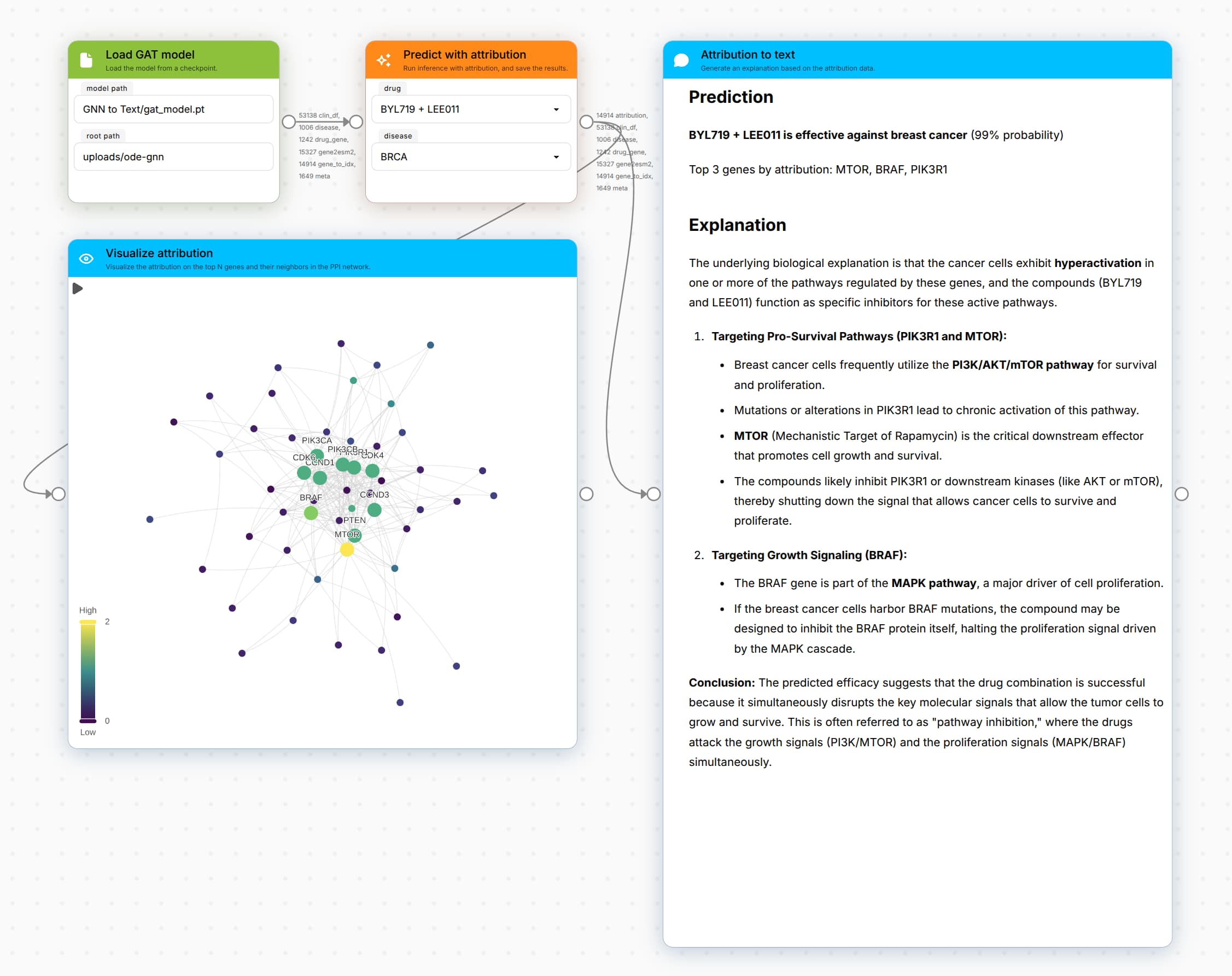
Wikipedia has nice summaries on these subjects, and we can see that the quality of the answer has significantly improved. As the prompt grew to more than 80,000 tokens, the generation time increased from a few seconds to more than a minute. Definitely worth the wait!