Analyzing LynxKite’s Git history
An animation of LynxKite’s development from 2014 to 2020:
The graph in this animation (created with Gource) is the directory tree of the source code.
I was struck by the big blue flower that blooms around the 0:54 mark. Turns out, it’s the 599 PNG
files in the web/app/images/emoji directory. They are there for a set of operations I had almost
forgotten about. (Set vertex attribute icons
and friends.)
It made me think about better ways to look at our Git history. Could we construct a graph that allows some kind of importance-based weighting?
Let’s see what we get if we connect files that are modified together in one commit. I wrote a small script that generates a CSV file.
git log --oneline --name-only | python git-to-graph.py > lk-git-graph.csvI drag & drop lk-git-graph.csv to a LynxKite workspace and look at it as a graph:
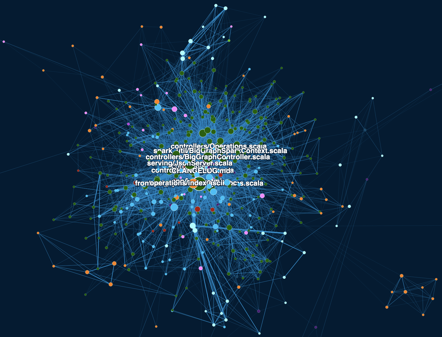
I have colored the nodes by the file extension and used the PageRank for their size. The parallel edges are merged automatically so the edge width shows how many times those two files have been modified in the same commit. I only display the file name for the top 10 nodes by PageRank.
Unfortunately this is a good example of why graph visualizations are often meaningless for large graphs. (And we’re only looking at 467 nodes. I have filtered out the low-PageRank nodes.) It’s a hairball with little discernible structure. What looks like structure may just be an artifact of the layout algorithm. The high-PageRank (high-degree) nodes are all drawn into the center because they are connected to everything.
One way to improve the situation is to use Node2vec to embed the nodes in a high-dimensional space according to the network structure. Node2vec is derived from Word2vec. Word2vec places “dog” and “hound” close by even though they are rarely used in the same sentence. Likewise, Node2vec will place files that play a similar role in LynxKite close together even if they are rarely modified at the same time.
I have then used t-SNE to project down the 20-dimensional embedding to 2 dimensions. t-SNE does a good job of projecting high-dimensional clusters to the plane in a way that makes them easy to see. So nodes that appear close together now should have a similar role in LynxKite.
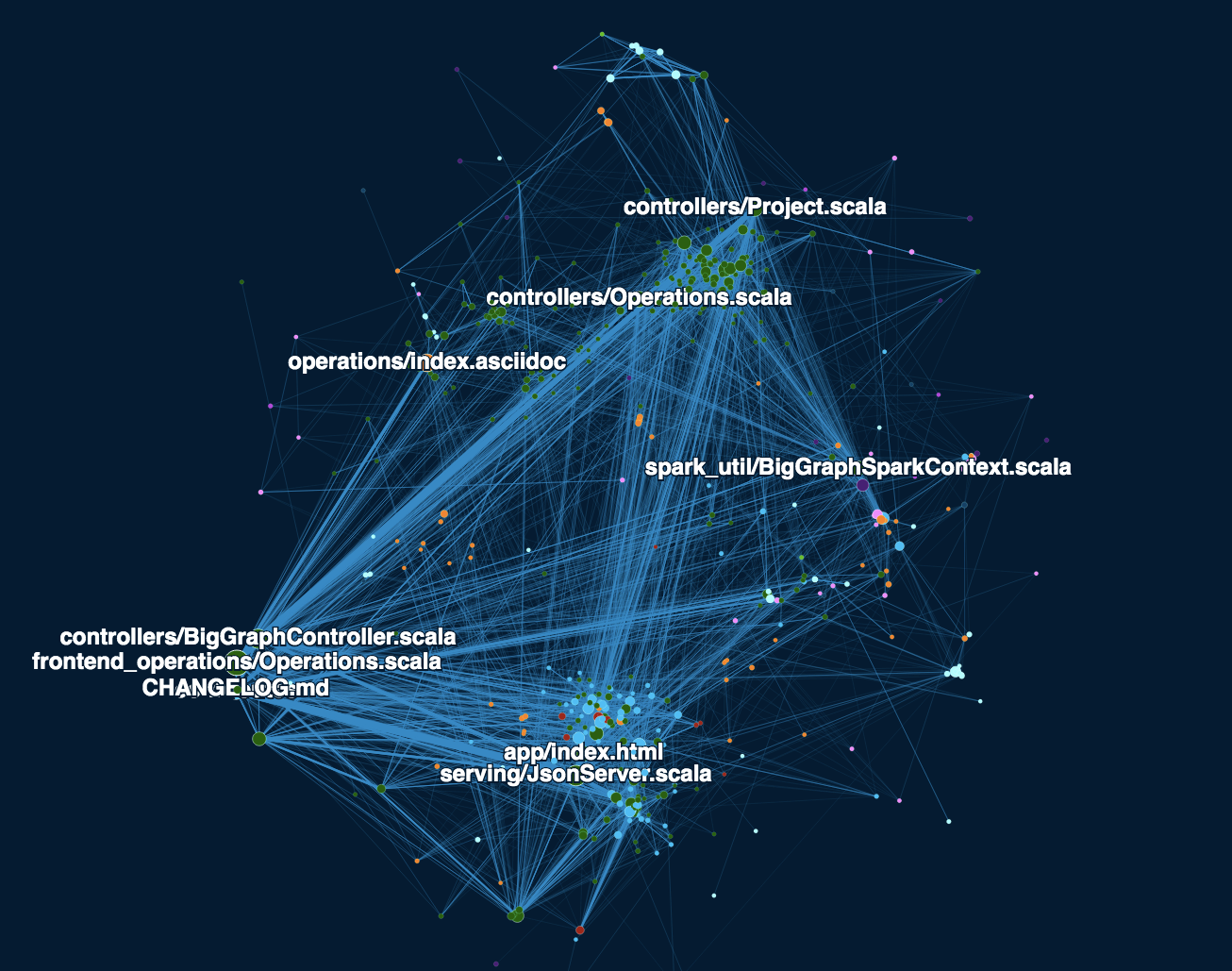
Much better! The bottom cluster with index.html and JsonServer.scala contains all
the files that get changed while working on frontend features. JsonServer.scala is
part of the backend, but it receives all the XHR requests from the frontend.
The cluster at the top with Project.scala and Operations.scala implements the core
backend functionality of graph algorithms. The files in the cluster around CHANGELOG.md
are often involved in major feature additions, such as a new HTTP endpoint.
In case you want to try this on your own Git repo, I’ve shared my workspace. (Just copy & paste the YAML code into a new LynxKite workspace, then import the CSV file you want to work with.)
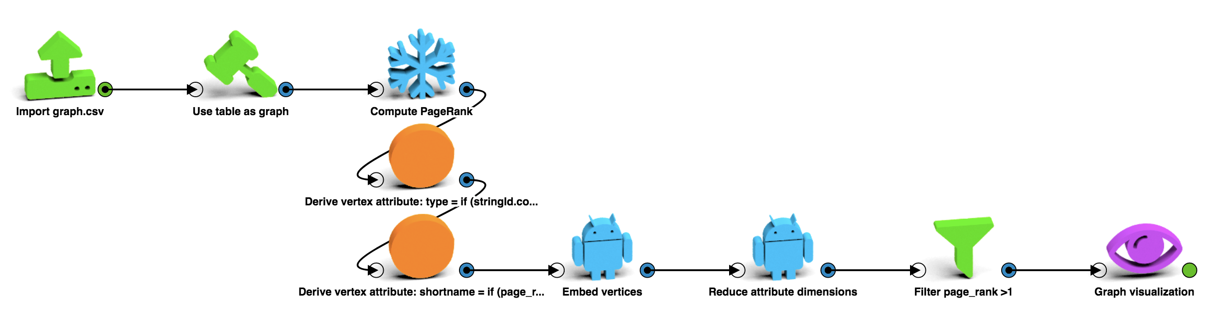
The default parameters have worked well for me, but for other Git histories it may be necessary to play with the parameters of t-SNE in the “Reduce attribute dimensions” box. See How to Use t-SNE Effectively on Distill for tips.
Edited to more accurately describe the expectations from using Node2vec and t-SNE.