Graph modeling in LynxKite is a breeze
The fun part of graph analytics starts once we have a nice graph to analyze. But to get there we have to first decide how to represent the data as a graph. Picking the right graph model is not trivial even for expert data scientists, not to mention the novice or citizen data scientists who need to get up on a steep learning curve.
In this blog post we show how easy it is to build a graph in LynxKite from tabular data. To demonstrate how versatile LynxKite is, we create 4 different types of graph models from the same input data.
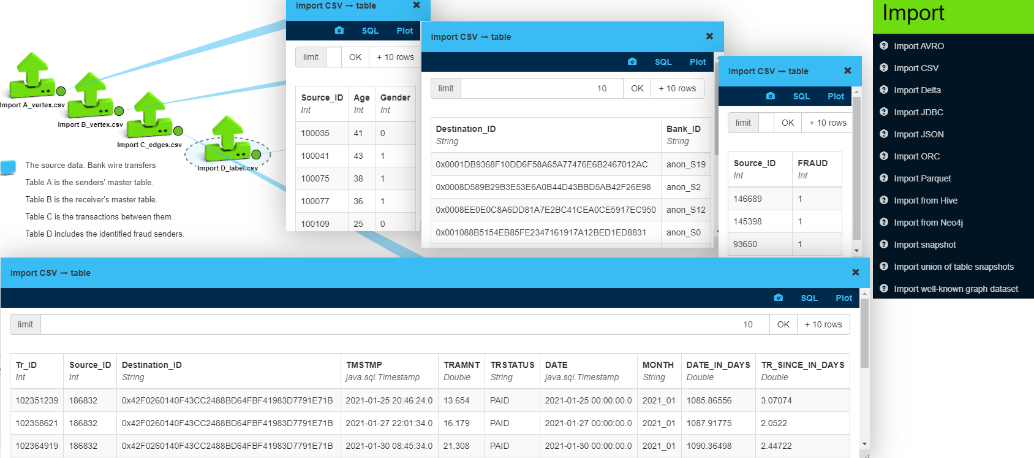
The inputs
Our inputs are 4 CSV files containing data for bank cross-border wire transfers between senders and receivers. Upon importing the data into LynxKite it is available in table format.
- File A is the senders’ master table (internal ID, age, gender).
- File B is the receiver’s master table (ID, foreign bank ID).
- File C is the transactions between them (sender ID, receiver ID, timestamp, amount).
- File D lists identified fraud senders (ID, fraud flag).
To create a graph model, we need to define the vertices (nodes) and the edges (connections) between them.
Option 1: Transactions as edges
For graph creation file C is key, as it contains the connections (transfer transactions). In LynxKite it is very easy to build a graph from these transactions with the “Use table as graph” box. Here we built a bipartite directed graph with 26,180 vertices and 150,181 edges. It is bipartite as it has two types of vertices where the vertices with the same type are not connected. Edges only go from the bank’s customers to foreign accounts in this dataset.
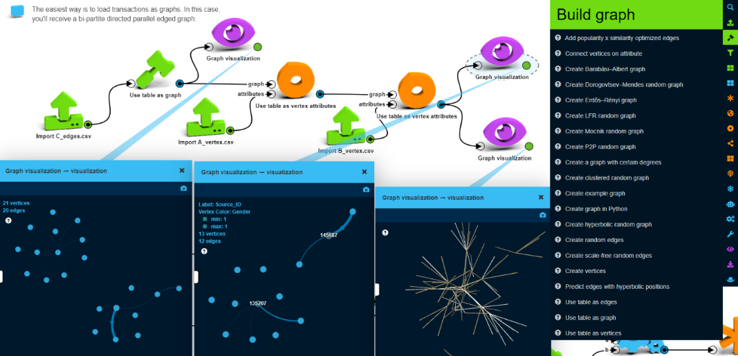
This is the most natural way of handling the input data. This graph model is useful for visualizing the interconnections and looking for patterns or specific senders or receivers. It is possible to create segments like connected components or communities, but these will always contain both senders and receivers. Some specific graph metrics (like embeddedness or clustering coefficient) will not be useful, because there cannot be any connections between one’s neighbors.
After we have the basic skeleton of this graph in LynxKite we enrich the graph from the other tables by adding attributes to the vertices. (“Use table as vertex attributes”) First to the senders from table A and then to the receivers from table B.
As we visualize the graph, we can see some concentration of transactions between certain senders and receivers (the parallel edges are collapsed here).
Option 2: Transactions as nodes
Now, let’s create a knowledge graph from this dataset. This format of the graph is more suitable for visual investigation. We can select a path of a transaction flow or we can use time to let connections appear or disappear. We don’t have to visualize all the connections, just those ones which are important for our research, so the size of the sample graph can be maintained. However, certain graph operations are less useful on this graph. E.g. propagating some features from one type of vertices to the same type of vertices is difficult, and machine learning algorithms become more complicated to set up.
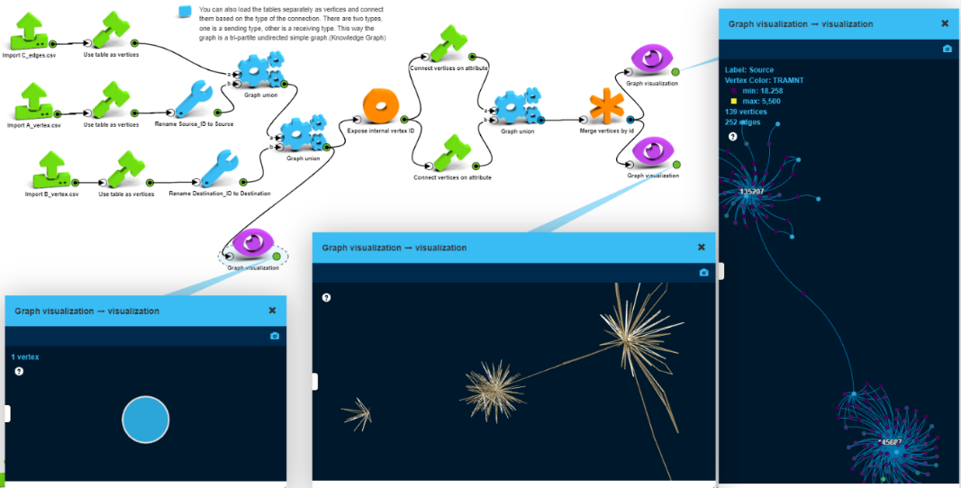
To build this graph, we will load the sender, the receiver, and transaction data separately and then connect them based on their association (transaction – sender – receiver).
First, we create a vertices-only graph with 176,361 vertices with no edges. Then we connect the transaction vertices with the participating sender and receiver vertices using the “Connect vertices on attribute” box. We can walk through this knowledge graph going from a sender via a transaction to the receiver.
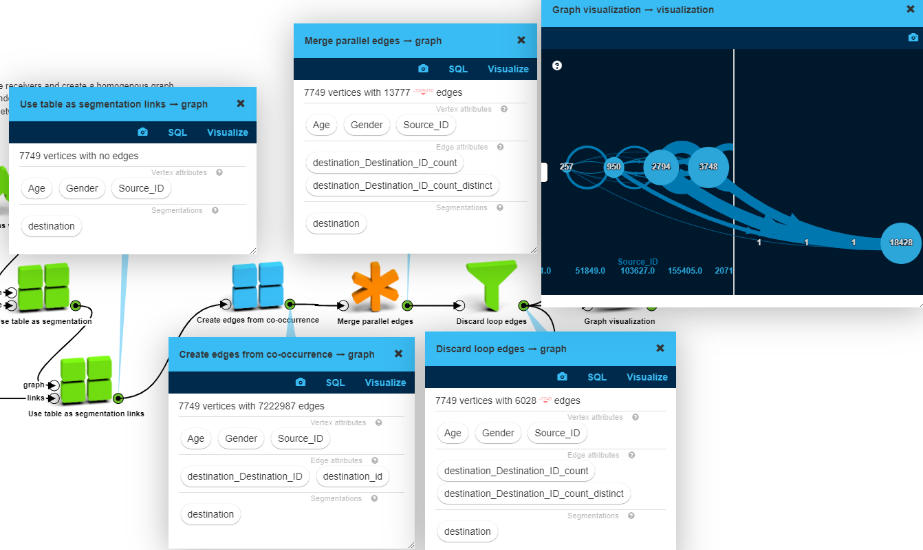
Option 3: Graph of senders by association
As a third approach, let’s create a social network graph for the senders (a unipartite graph). We exclude the receivers and create a homogenous graph of senders. We connect two senders if they have common receivers (aka “friends”).
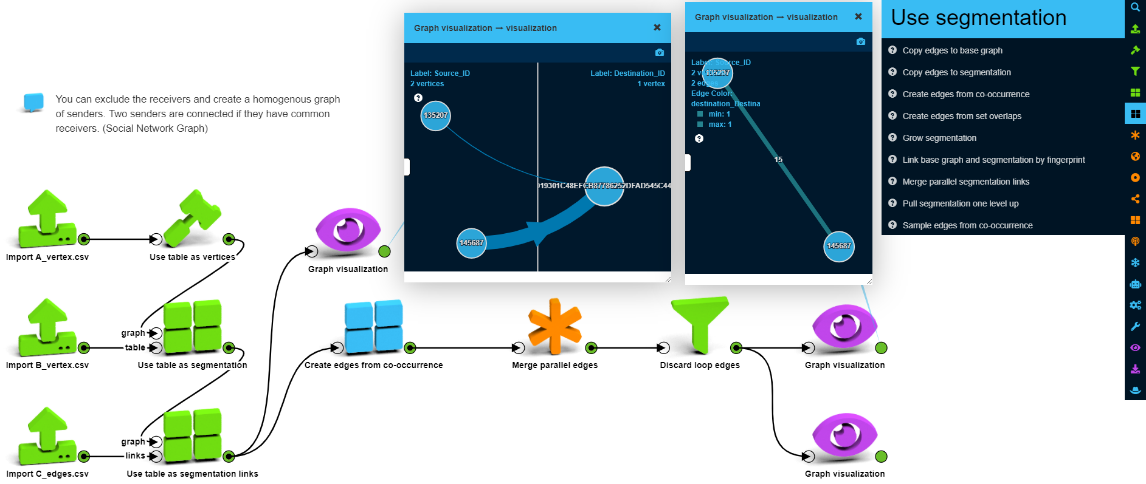
LynxKite has numerous graph segmentation operations – which come handy in this case to structure this graph. “Use table as segmentation” allows segmentation of a graph based on a mapping table.
Let’s use some of the operators to normalize and simplify the graph by collapsing and reducing the edges to make it more manageable. This graph format is perfect for almost all graph operations. Embeddedness or clustering will be meaningful and segmentations will be obvious. Running GCN or other machine learning algorithms is easy. Certainly, while we win something on one side it can be a loss on the other side. As we collapsed the receivers, now we don’t know too much about them or the transactions. Some features of the receivers or the transactions can be saved as edge attributes, but those will be highly aggregated and thus difficult use or search.
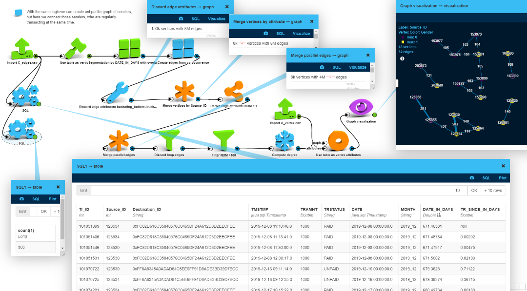
Option 4: Graph of senders by time
Finally, with the same logic, let’s create a unipartite graph of senders, but here we
connect those senders, who are regularly transacting almost at the same time. To achieve
this, we segment the graph along the timeline and filter out those who do this over 100
times. This way we found two senders (123530 and 123534) who
transacted right after each other frequently (502 times).
Summary
As we can see, from the same data there are many options to build a graph model – where LynxKite provides over 200 operations with a low-code (or no-code) UI to make this easy for everyone ranging from expert data scientists through non-expert data scientists or analysts.