LynxKite Tutorial: Flight Routes
Try LynxKite
In this tutorial you will learn about the basics of importing data into LynxKite, exploring it, and deriving data science results.
Our goal
For this tutorial we want to analyse a public flight route database and find the airports that are most critical to international travel.
If you want to follow along, you can download the OpenFlights.org
Flight Route Database
from Kaggle and extract routes.csv.
Creating a workspace
If you have found the LynxKite download page and read the “Getting started” guide, you should have a running LynxKite instance.
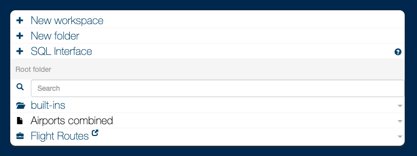
The LynxKite UI welcomes you with the directory browser interface.
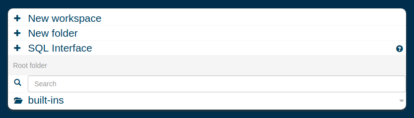
Let’s create your first workspace! Click on “New workspace”, enter the workspace name, and press enter.
You then see your new workspace:
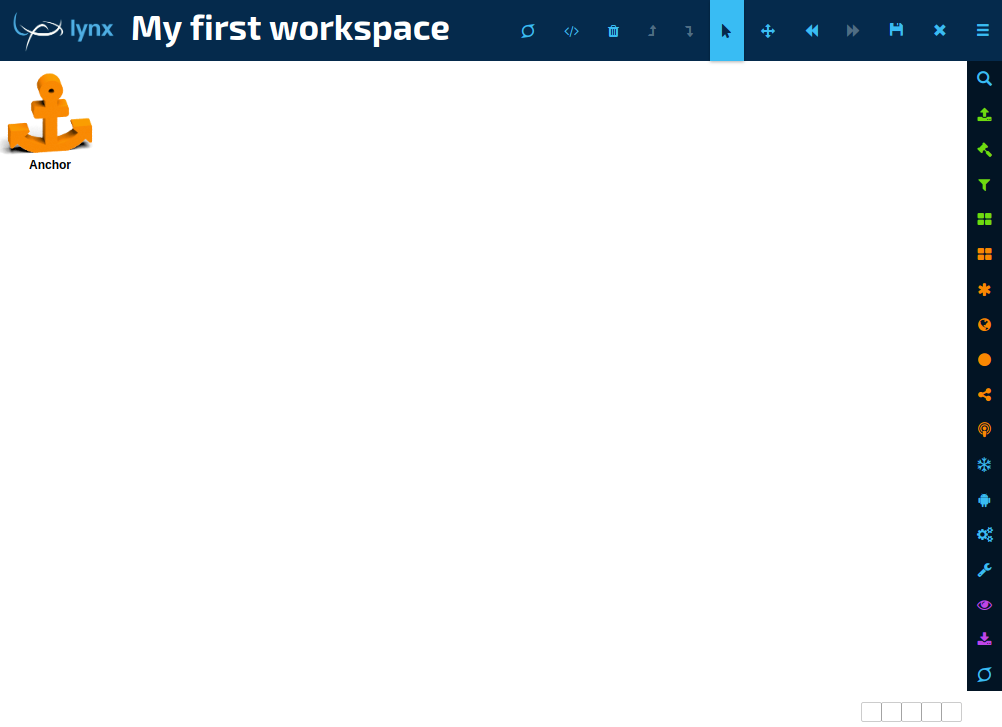
Your workspace is empty. Time to add some boxes. Boxes are kept in the categories on the right side. Click a category to open it, then drag the box name into the workspace with the mouse.
Tips:
- Press
/and type something to search for a box. - You can click on a box to adjust its parameters.
- You can click on one of its outputs to look at that output.
- You can connect outputs to inputs by dragging, or by touching one box to the other.
- Hold SHIFT while dragging to neatly align boxes.
For an in-depth introduction to what all the buttons you see do, see the Workspace user interface section of the LynxKite User Guide.
From CSV to graph
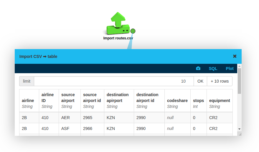
Drag and drop routes.csv from your file system into the workspace you opened above. The
Import CSV
box outputs a table. (For other ways of importing files, see the box’s documentation.)
Click on the output plug to take a look at the imported data.
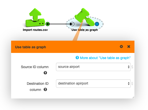
We can build a graph from this table by treating each record as an edge in a graph that connects the source airport to the destination airport.
- Place a Use table as graph box in the
workspace. (Either drag it from the “Build graph” category, or search
for it by pressing
/and typing a few words.) - Connect the output (right side plug) of Import routes.csv to the input (left side plug) of Use table as graph either by touching them while dragging or by dragging a connection between the two plugs with the mouse after placement.
- Click Use table as graph and pick the right source and destination columns in the box parameters popup.
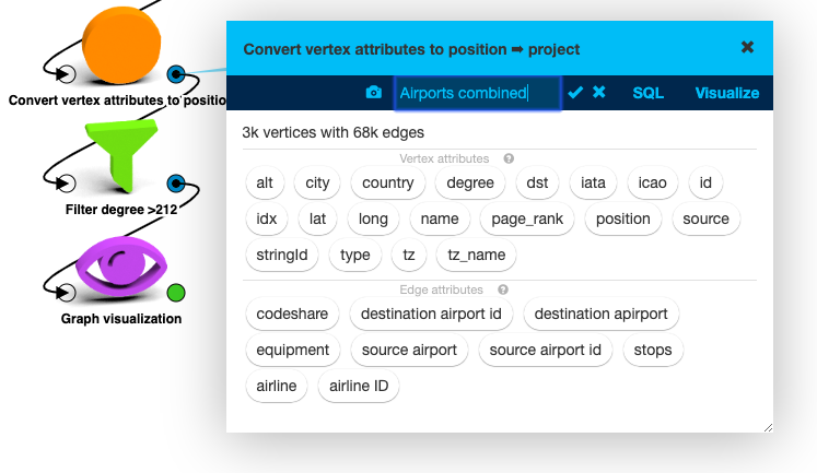
This box outputs a “project”, which is a graph with some accompanying data. It has around 3,000 vertices and 68,000 edges. Place a Graph visualization box to take a closer look at the data.
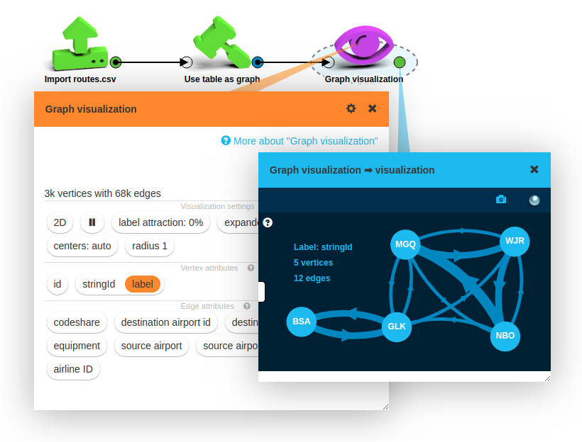
The visualization box gives you a lot of options for customizing what you see.
On the screenshot the stringId vertex attribute is set as the vertex label. (We could achieve this by simply clicking the stringId button and selecting the desired visualization option.)
This attribute was automatically added by the Use table as graph box, and it contains
the name that the source and destination columns have used for that vertex.
The visualization by default only shows a small sample of the graph. It randomly picks a center vertex and shows the radius-1 neighborhood.
For much more detail about every box mentioned, follow the links to the relevant LynxKite User Guide section.
Airport importance
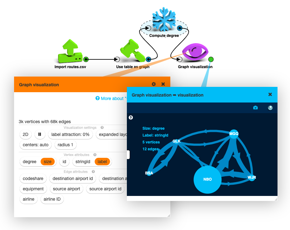
A super easy measure of the importance of vertices is their degree: the number of edges that
are attached to them. You can add a Compute degree
box and attach it between Use table as graph and Graph visualization.
Graph visualization will now list a new vertex attribute, degree.
We can visualize degree as the size of the vertices:
LynxKite offers a large number of interesting vertex metrics that we could use, but the idea is the same. If you’re interested, add another metric, like Compute PageRank or centrality.
Once you have more than one metric it can be interesting to see the relationship between two of them. If you want a simple scatter plot, you can use the Custom plot box.
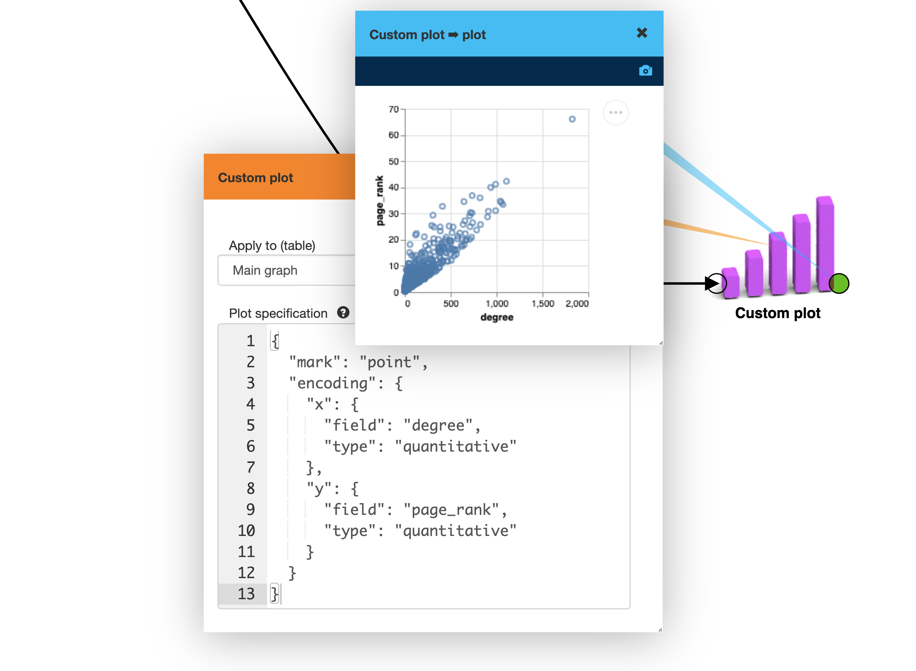
This plot tells you about the relationship between vertex degree and vertex PageRank. But we don’t know what is going on with the edges. For that we can switch the Graph visualization box to the bucketed view. In this mode vertices are within the same degree and PageRank range are bucketed together to be displayed as a single vertex. You can switch the buckets to logarithmic scaling the get more practical buckets.
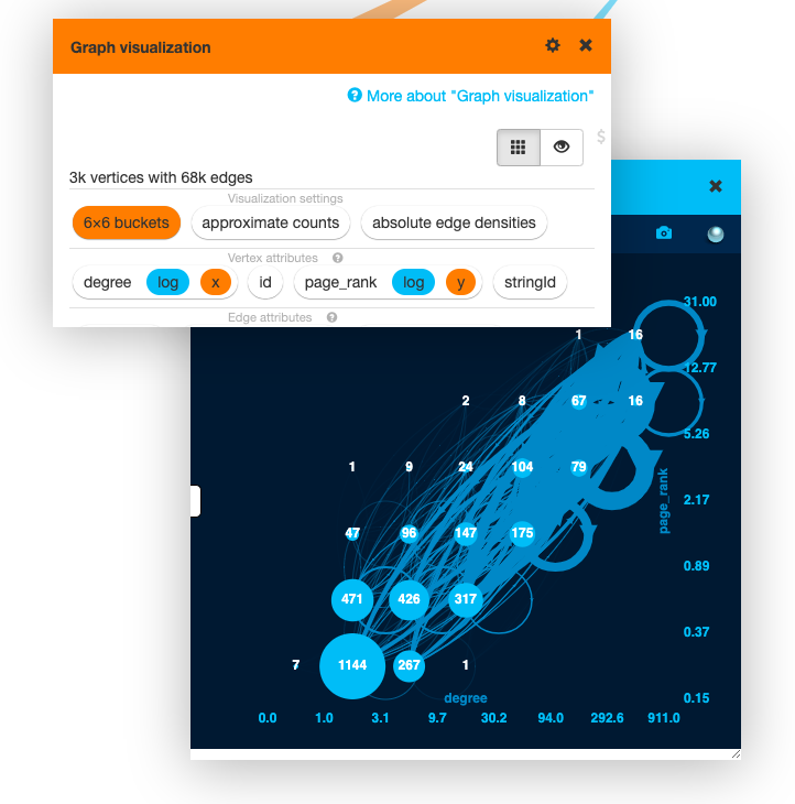
The thick loop edges on the medium degree and medium PageRank vertices in this view highlight the importance of this population of airports.
Eyeballing plots is great fun. But when you want solid numbers, often the best option is to run some SQL. You can attach a SQL1 box to any project or table output to run queries on it.
For example, let’s say we want to check the median of the greater of the source and destination degrees on edges. It’s easy to do, because when querying edges we can also refer to attributes of the edges’ source and destination vertices:
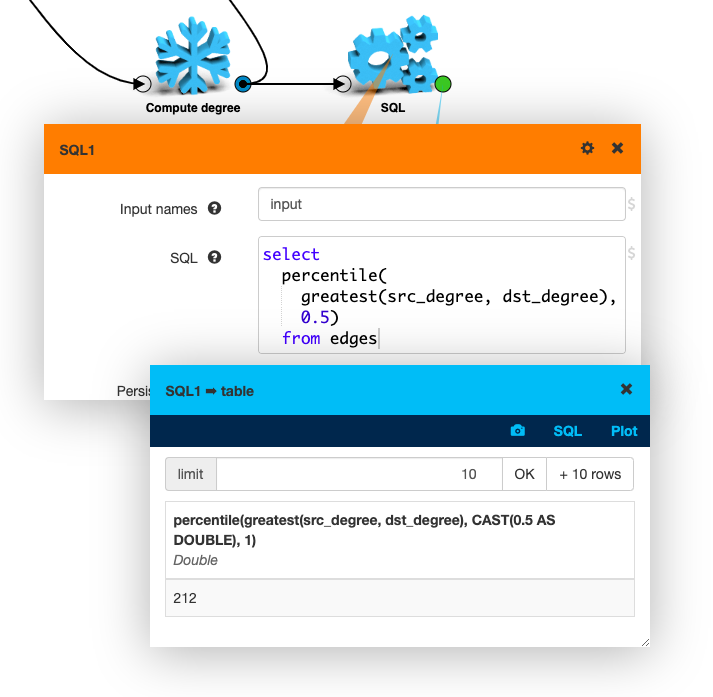
Half the flight routes then are connected to airports that host 212 or more routes.
Putting it on a map
As long as we are looking at a geographic dataset, it’s natural to want to put it on a map. For that we need geographic coordinates for the airports though.
The OpenFlights.org Airports, Train Stations, and Ferry Terminals
dataset on Kaggle contains just what we need. But when you drag & drop airports-extended.csv
to your workspace, the result is not great.
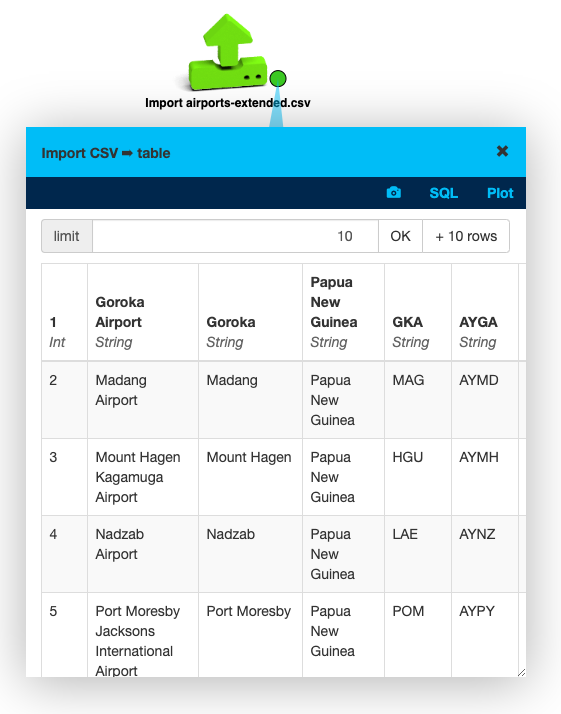
We have columns such as 1, Goroka Airport, and Papua New Guinea. Looks like this CSV has
no header, and LynxKite is treating the first line of data as a header.
To fix this open up the Import CSV box’s parameters, and set Columns in file to the list
of columns. (idx,name,city,country,iata,icao,lat,long,alt,tz,dst,tz_name,type,source)
Then you need to repeat the import process by clicking the ▶ button at the bottom of the
parameter list.
As the error message tells you, the Infer types option must also be turned off in this mode. Not a problem: we can easily convert the types later.
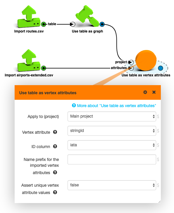
But now this table is ready to be joined to our graph. The three-letter IATA code can be used to look up the new vertex attributes with the Use table as vertex attributes box.
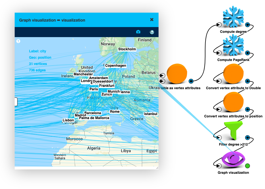
Then you can convert the latitude and longitude vertex attributes into a single position attribute
with the Convert vertex attributes to position
box and chart the biggest airports on Google Maps. For this, you have to click on the Graph visualization box, click on the newly created position attribute and select Geo coordinates as the visualization option.
Snapshots
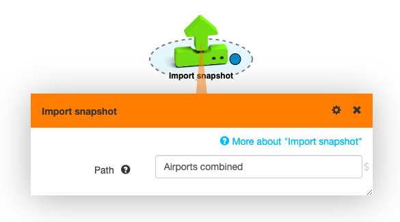
When you have a dataset that you really like, such as this combined airport graph, it’s useful to save it for further use.
Every box output popup has a camera icon () for taking a snapshot. Snapshots are stored in LynxKite’s directory tree and you can import one in another workspace with the Import snapshot box.
Another way to share boxes between workspaces is copying the selected boxes through the system clipboard with Ctrl-C / Ctrl-V. Boxes are copied to the clipboard in a text format, so you can even share them over email.
A third way is to save some part of your workspace as a custom box and use it in other workspaces.
LynxKite’s Python API
When LynxKite is running you can also use it from Python. The UI and the Python API provide the same features and you can easily switch between the two.
Install the Python package:
pip install lynxkite-client
(Requires Python 3.6 or newer.)
Then in Python:
>>> import lynx.kite
>>> lk = lynx.kite.LynxKite(address='http://localhost:2200/')
>>> lk.createExampleGraph().sql('select count(*) from vertices').df()
   count(1)
0       4.0
If you are unsure how a box is called or parameterized in the Python API, create it on the UI and
click the </> button in the toolbar to see the auto-generated Python code.
For more details see the Python API tutorial and the Python API docs.
Further reading
If you’ve read through this tutorial, you now have a taste of LynxKite’s features. The LynxKite User Guide goes into much more detail about all features in a systematic way.
If you have any questions or comments, we are happy to hear from you at lynxkite@lynxanalytics.com.